“Now that it has been formally adopted and approved..” (applause)
Approved and unveiled by the city commission Mayor Ken Johnson says Muskegon is ready to roll out their new logo.
“People are going to have differing views I like this but I don’t like that it is in eye of beholder”
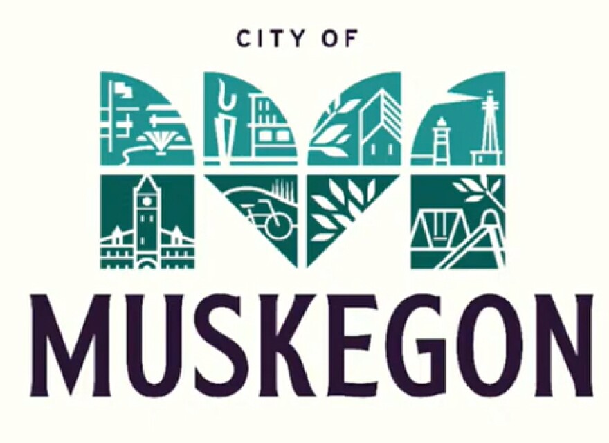
The new logo is an “M” fashioned out of 8 blocks, inside each a silhouette of some significant city landmark.

“We are made up of many features that a lot of people throughout the community love.”
Muskegon community engagement manager Deborah Sweet.
“It’s not sun it’s not dunes because our residents believe we are more than that.”
The new logo replaces the old familiar purple design that included a sailboat, a musical instrument and the former Hackley Administration Building. Dan Kalisz of Kindred Marketing developed the new logo.
“Something in here will hopefully resonate with everyone. We can’t make everybody happy we know that.”
To create the new logo city manager Jonathan Seyferth says there were many meetings, dozens of opinions were considered, a community survey was distributed.
“This was the number one pick of everybody.”


